主要参考: ☞Seaborn 教程 | 菜鸟教程
☞matplotlib中cmap与color参数的设置_camp颜色-CSDN博客(比较全)
☞seaborn分面技巧 | Haizhen’s Blog(非常形象生动)
☞Seaborn 绘图中的图例 | D栈 - Delft Stack
预设部分
1. 导入库
import seaborn as sns
import matplotlib.pyplot as plt
import pandas as pd
2. 设置theme
2. 1设置style
sns.set_theme(style="whitegrid") # 可选 'darkgrid', 'whitegrid', 'dark', 'white', 'ticks'- darkgrid(默认):深色网格主题
- whitegrid:浅色网格主题
- dark:深色主题,没有网格
- white:浅色主题,没有网格
- ticks:深色主题,带有刻度标记
2. 2设置palette
sns.set_theme(palette="pastel") # 全局设置

barplot(palette="pastel") # 单图设置很全的配色效果见☞matplotlib中cmap与color参数的设置_camp颜色-CSDN博客
更多专业性配色参考☞在Matplotlib中选择颜色映射 — Matplotlib 3.3.3 文档
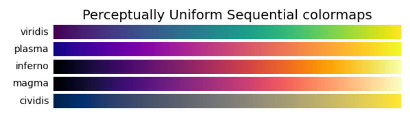
注:下面示例图片使用的palette是"Set2"
2. 3设置context(模版)
sns.set_theme(context="paper")
- paper:适用于小图,具有较小的标签和线条
- notebook(默认):适用于笔记本电脑和类似环境,具有中等大小的标签和线条。
- talk:适用于演讲幻灯片,具有大尺寸的标签和线条。
- poster:适用于海报,具有非常大的标签和线条。
4. 加载示例数据集
# 内置数据集示例
tips = sns.load_dataset("tips")
iris = sns.load_dataset("iris")
5. 简单描述
以tips为例
print("---tips.describe()---")
print(tips.describe())

print("---tips.info()---")
print(tips.info())

print("---tips.head()---")
print(tips.head())
-----------输出结果------------
---tips.describe()---
       total_bill         tip        size
count  244.000000  244.000000  244.000000
mean    19.785943    2.998279    2.569672
std      8.902412    1.383638    0.951100
min      3.070000    1.000000    1.000000
25%     13.347500    2.000000    2.000000
50%     17.795000    2.900000    2.000000
75%     24.127500    3.562500    3.000000
max     50.810000   10.000000    6.000000
---tips.info()---
<class 'pandas.core.frame.DataFrame'>
RangeIndex: 244 entries, 0 to 243
Data columns (total 7 columns):
 #   Column      Non-Null Count  Dtype
---  ------      --------------  -----
 0   total_bill  244 non-null    float64
 1   tip         244 non-null    float64
 2   sex         244 non-null    category
 3   smoker      244 non-null    category
 4   day         244 non-null    category
 5   time        244 non-null    category
 6   size        244 non-null    int64
dtypes: category(4), float64(2), int64(1)
memory usage: 7.4 KB
None
---tips.head()---
   total_bill   tip     sex smoker  day    time  size
0       16.99  1.01  Female     No  Sun  Dinner     2
1       10.34  1.66    Male     No  Sun  Dinner     3
2       21.01  3.50    Male     No  Sun  Dinner     3
3       23.68  3.31    Male     No  Sun  Dinner     2
4       24.59  3.61  Female     No  Sun  Dinner     4
绘图部分
1. 单变量图
1.1 直方图histplot
sns.histplot(data=tips, x="total_bill", kde=True)
plt.show()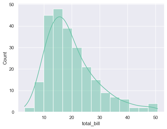
1.2 核密度估计图kdeplot
sns.kdeplot(data=tips, x="total_bill", shade=True)
plt.show()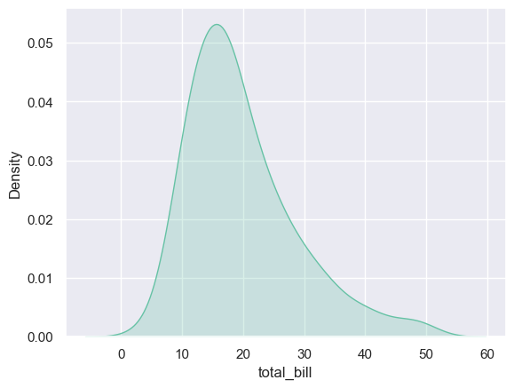
1.3 箱线图boxplot
sns.boxplot(data=tips, x="day", y="total_bill")
plt.show()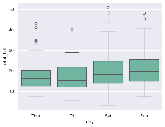
1.4 小提琴图violinplot
sns.violinplot(data=tips, x="day", y="total_bill", hue="sex", split=True)
plt.show()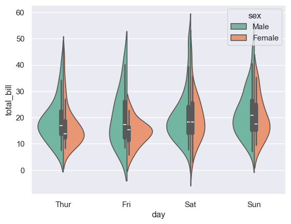
1.5 条形图barplot
sns.barplot(data=tips, x="day", y="total_bill", hue="sex")
plt.show()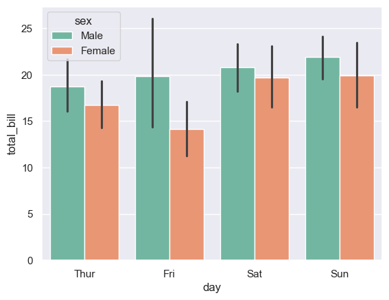
2. 双变量图
2.1 散点图scatterplot
sns.scatterplot(data=tips, x="total_bill", y="tip", hue="time")
plt.show()


### 5.2 线性回归图`lmplot`

```python
sns.lmplot(data=tips, x="total_bill", y="tip", hue="sex")
plt.show()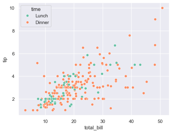
2.2 线性回归图lmplot
sns.lmplot(data=tips, x="total_bill", y="tip", hue="sex")

plt.show()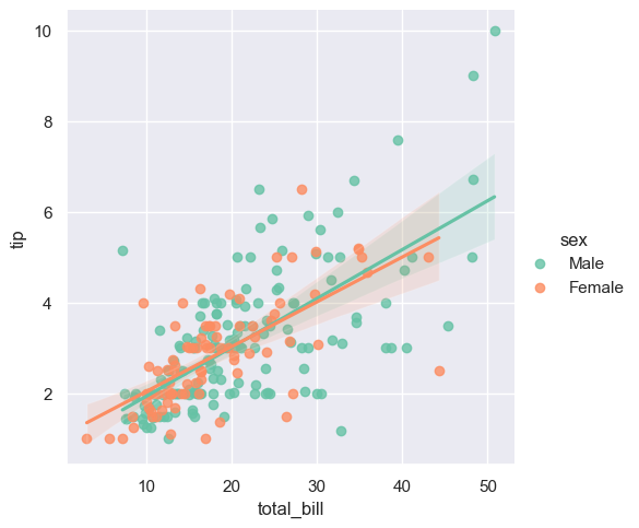
2.3 联合分布图jointplot
sns.jointplot(data=tips, x="total_bill", y="tip", kind="hex")
plt.show()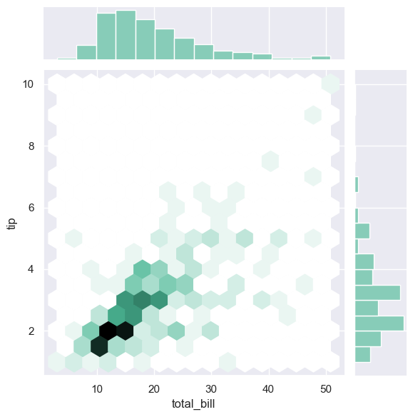
3. 矩阵图
3.1 热力图heatmap
corr = tips.corr()
sns.heatmap(corr, annot=True, cmap="Set2")
plt.show()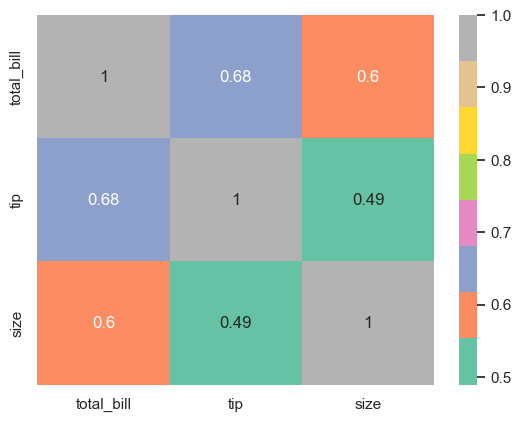
个人认为,不如cmap="maga"好看
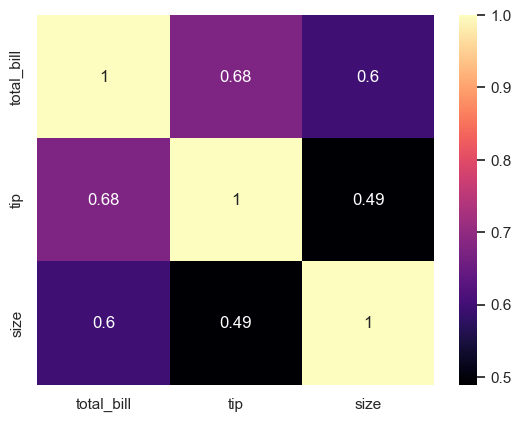
此处的cmap也可以参考☞matplotlib中cmap与color参数的设置_camp颜色-CSDN博客
3.2 成对关系图pairplot
sns.pairplot(iris, hue="species")
plt.show()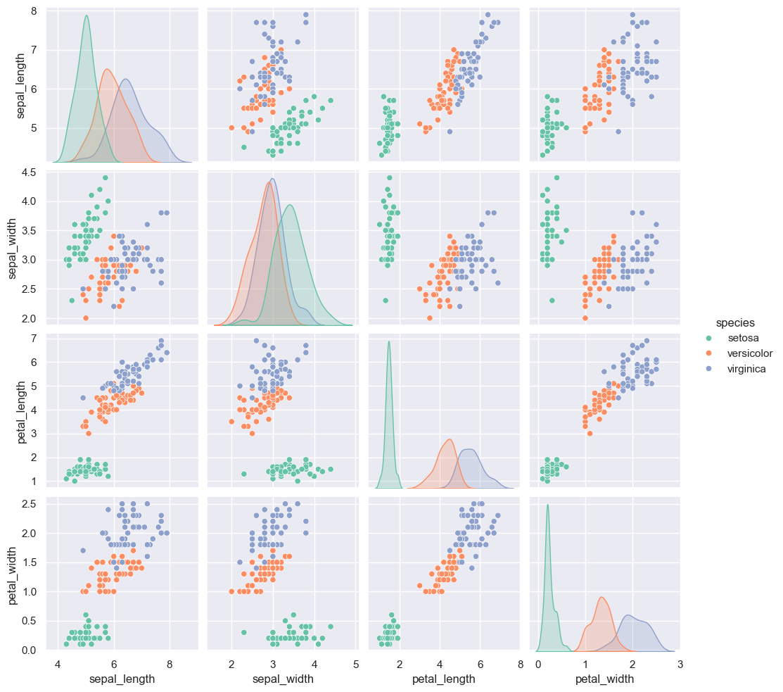
4. 分类数据图
4.1 点图stripplot
sns.stripplot(data=tips, x="day", y="total_bill", jitter=True)
plt.show()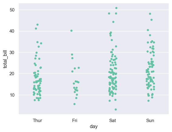
4.2 抖动图stripplot
通常,多个数据点具有完全相同的 X 和 Y 值。 结果,多个点绘制会重叠并隐藏。 为避免这种情况,请将数据点稍微抖动,以便可以直观地看到它们。
sns.swarmplot(data=tips, x="day", y="total_bill", hue="sex", dodge=True)
plt.show()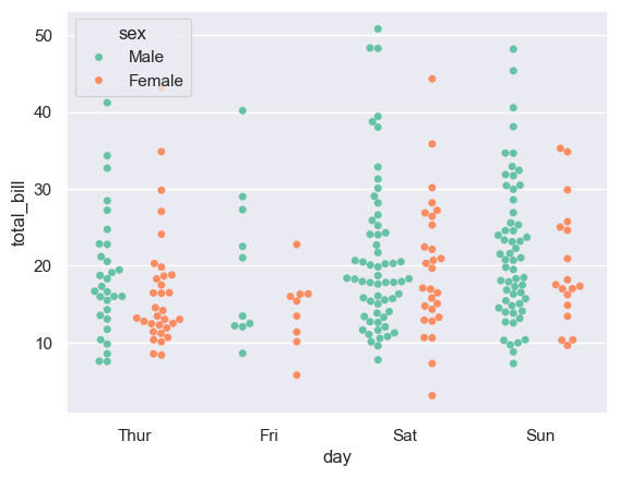
5. 分面对比图FacetGrid
g = sns.FacetGrid(tips, col="time", row="smoker")
g.map(sns.histplot, "total_bill")
plt.show()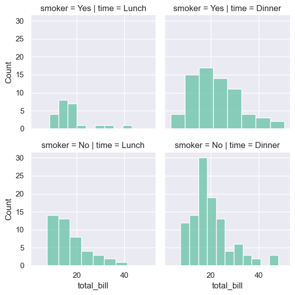
关于分面图的理解与技巧☞seaborn分面技巧 | Haizhen’s Blog
图片微调
调整figsize,legend,axis,title与text
1. figsize
plt.figure(figsize=(10, 6))
sns.boxplot(data=tips, x="day", y="total_bill")
plt.show()
2. legend
图例部分参考☞Seaborn 绘图中的图例 | D栈 - Delft Stack
# 删除
plt.legend().remove()
图片略,简而言之就是纯享版(啥图例也没有)~
sns.lmplot(data=tips, x="total_bill", y="tip", hue="sex")

plt.legend(
    labels=["Legend_Day1", "Legend_Day2"],
    title="Title_Legend",
    fontsize="large",
    title_fontsize="10",
)

plt.show()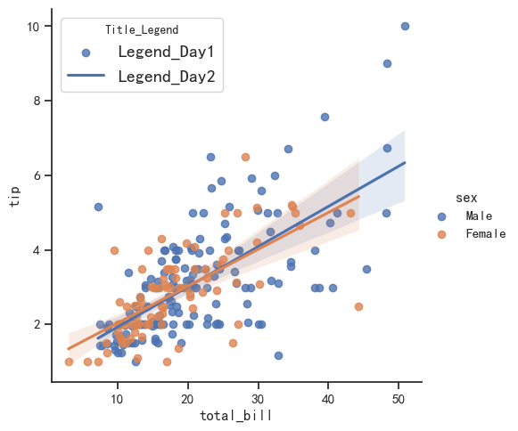
sns.lmplot(data=tips, x="total_bill", y="tip", hue="sex")

plt.legend(labels=["Legend_Day1", "Legend_Day2"], loc=2, bbox_to_anchor=(1, 1))

plt.show()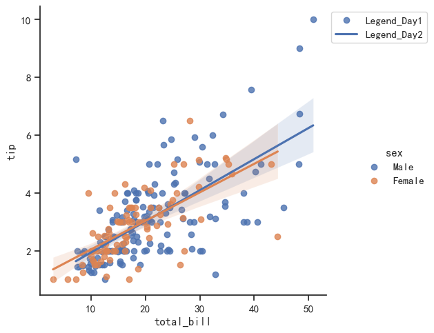
3. axis
# Set labels and limits
plt.xlabel('X-axis')
plt.ylabel('Y-axis')
plt.xlim(0, 6)
plt.ylim(0, 12)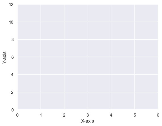
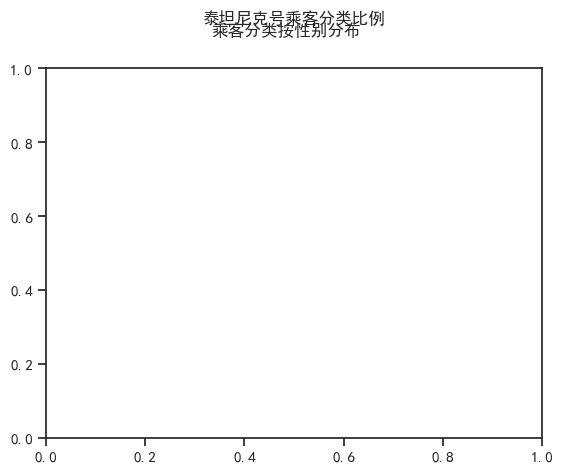
4. title与text
plt.title("泰坦尼克号乘客分类比例", y=1.1)  # 设置标题的位置稍微偏离上方
plt.figtext(0.5, 0.95, "乘客分类按性别分布", ha="center", fontsize=12, fontweight='bold')  # 设置副标题的位置
Warning
注:显示中文需要先运行如下代码
import pandas as pd
import matplotlib.pyplot as plt
import seaborn as sns
%matplotlib inline

rc = {'font.sans-serif': 'SimHei',
      'axes.unicode_minus': False} #设置字体样式 字体负号显示
sns.set(context='notebook', style='ticks', rc=rc) #sns设置
保存图形savefig
plt.savefig("boxplot.png")
plt.show()不过通常就直接ctrl+c,没这么费劲哈哈!
2024年7月17日06:30:22